Wednesday 27 September 2017

Final Reflections on Exploring Ideas Course

Exploring Ideas course has been an emotive and challenging journey. I made a few difficult decisions at the end. But I am not going to get emotional. I want to keep this blog post short and list my takeaway points from my learning.

Assignment 1: Cultural Infusions: This assignment gave me the opportunity to dive into my own heritage and work with some of my mum’s own vintage textiles. It was great to talk to her about her work. I looked into techniques like Gold Work and Cross Stitch, which are way out of my comfort zone. I didn’t use to like traditional techniques because they focus on getting the technique perfect. I tried my hand at them, explored how they can be pushed forward. I ended up making The Mask. Figuring out how to construct it was a lot of work. In hindsight, I shouldn’t have spent so much time on an assignment that is not going to be assessed. But I learned to overcome my own judgment of what I thought to be traditional. It also gave me the confidence to design more structural textile pieces.
S Payne - The Mask
 Assignment 2: Screen Printing: It is really challenging to produce good prints without proper facilities, which many OCA students don’t have at home. I took my tutor’s (Pat Hodson) advice and signed up for a local Screen Printing course. The experience was invaluable. I learned different print mediums and techniques. I tried to achieve some of the successes at home. For this assignment, I was focused on designing patterns. In all my drawings, inspirations from source images, I attempted to see and create patterns. I loved this process. I ended up producing many samples and tried as many techniques as possible.
S Payne - Screen Print Design
Assignment 3: Reveal and Conceal: This was my favourite assignment. I found the ‘material led approach’ very liberating. It is great to observe, respond and record how the material behaves once a manipulation technique is applied. It is an experimental and playful approach. I enjoyed responding to the process rather than following a strict plan and getting upset about when things go wrong. I tried to explore outcomes emotionally as well as visually. It really helped me loosen up. It shows in my sketchbooks too. I used my sketchbooks not just for drawing, but for recording, collecting, collaging, juxtaposing, photocopying, mark making, pattern searching.
S Payne - Mixed Media Textile Piece
Assignment 4: Contextual Studies: This was my least favourite assignment. Particularly because I found not having access to proper resources very limiting. At the time I did the assignment, OCA students were not allowed to borrow books from UCA Farnham Library. I went to the library and looked up and photocopied as many articles as possible. Access to their electronic library would have been invaluable. I found lot resources online too. I already knew some of the names I am assigned to research already. Still, I discovered artists whose work I wasn’t familiar before; eg: Yinka Shonibare, Leon Bakst, Magdalena Abakanowicz. I wrote my essay on Magdalena Abakanowicz. Her art and her desire to make art was inspirational. I really enjoyed studying Issey Miyake in depth. 

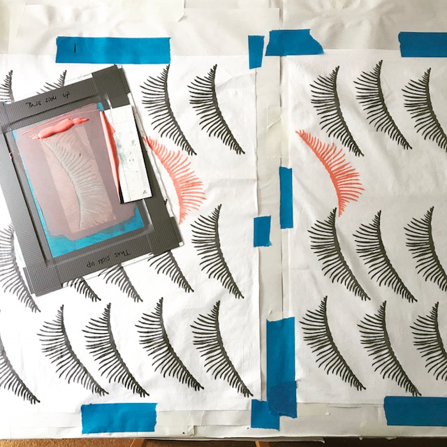
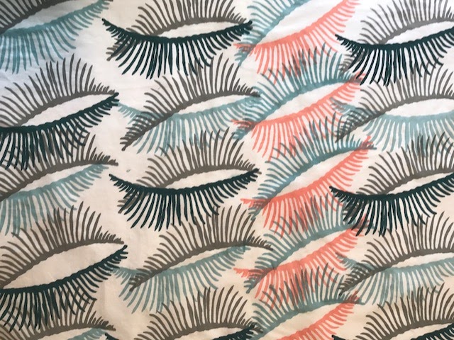
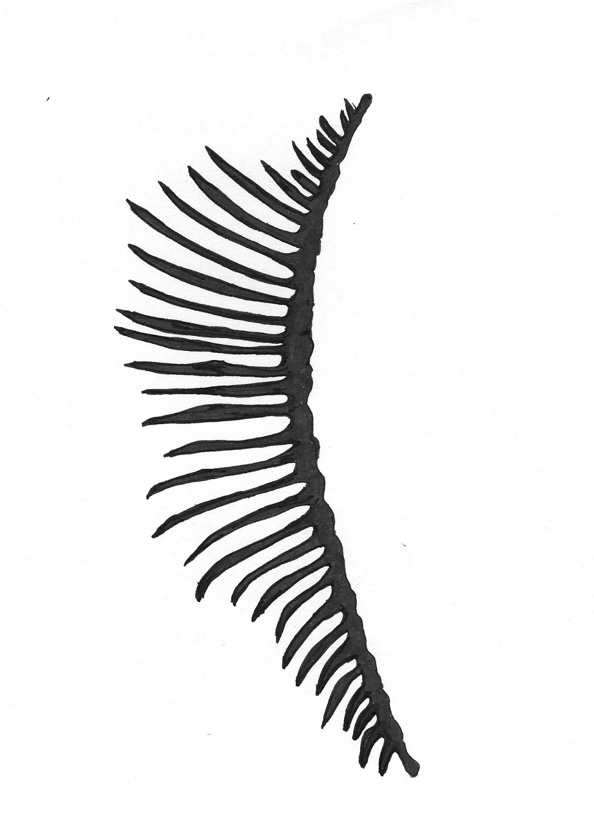
Assignment 5: Personal Project: I tried to apply my learning to this project. I chose a simple source image/inspiration: fish bones. I tried to note the feelings this image evoked in me and I aimed to emulate them. I wanted to design a surface using printing but I wasn’t sure how the process would develop. I worked fast due to time constraints but I worked focused. I did a lot of drawings before settling down to the final design. To create a print with enough detail and clarity, I decided to design a thermofax screen for my final print. I wasn’t happy with my first prints. Therefore I changed the colour and darkened the tones. I introduced machine and hand stitching to refer to the structures of first sketches. End-result is a constructed fabric, which can be made into a garment. 
S Payne - Personal Project Surface Design
My tutor Neil Musson (assignment 3 onwards) told me that I demonstrate a continuity of ideas and attention to detail in quality. He would have liked to see more sampling and I can take colour ideas further. He also emphasized that I need to record more thoughts and explanations in my sketchbooks. I usually write my thoughts and reflections on my blog. I guess I need to develop a more intimate relationship with my sketchbook. I think my sketchbooks are getting better but I still have a long way to go developing my own style and working methods.

I hope my portfolio demonstrates the skills I developed. Through this course, I fell in love with surface design and printing. I very much love to explore more.

I feel accomplished finishing the course but I am also aware the amount I need to learn to improve my textile practice. It is a lifelong learning journey.


Monday 29 May 2017

Assignment 5 - Personal Project - The Final Design


Making the Final Piece:

I started with mixing my colours. I am using Selestine pigments and solvent-free binder to prepare my printing pastes. I chose deep dark to light blues accompanied with a contrasting orangy peach. I had a good idea where I wanted to go with the colours and used my trusted colour wheel to guide me.  However, I am not sure if I should print on white or coloured fabric? And the pattern design is still work in progress. I want to do some test prints before I finalise the design.
S Payne - Mixing colours for print
I am very pleased with my thermoflax screens. However printing with them is tricky. Ghosting is a big problem, messing up my pattern. I started to use a hairdryer and dry as soon as I print. I am printing on lightweight cotton in white. I want the fabric to be fluid and light.
My thermoflax screen
S Payne Test Print - Ghosting is a major issue!
Pattern… After initial test prints, I decided that I don’t want the print to look too precise. I still wanted that hand printed feel. I planned the pattern so that I know how to position my screen. I am still working organically following the pattern design but not to the letter. After all, the plan is a scribble on an A4 paper. I am only using the Screen No1. The combining two designs did not work well.
S Payne Test Print - Combining two designs doesn't work
I love the print on white fabric. It’ll make a great garment, a skirt perhaps? But it is too cheerful, too pretty and too spring-like. I want the final piece reference the source images and imitate the feeling they evoke.
S Payne - Printing on white fabric
S Payne- Finished print on white cotton fabric
S Payne - Initial garment ideas 
I used a blank screen to create a grey background. Using same colour palate, the prints on grey are more muted and moodier. I still want to introduce stitch to the mix.  After some thought and sketching, I decided that I want the final fabric to be constructed from 3 different pieces joined up loosely. There will be gaps and long stitches to join them. I bought polyester lining fabric to print on it with the darkest blue. I am thinking to use a combination of machine stitch and hand stitch over the prints. At this stage, I am short of time so I’ll just go for it.
S Payne - Print of Grey background.  
S Payne- Machine Embroidering on printed fabric
This is working. I am glad I was bold to introduce stitching.  It enriched the texture and made the surface much more interesting. I constructed the fabric by sewing the parts together. I used a net over the machine embroidered piece to add more texture. The net created a gap between parts too. I hand stitched them with long stitches to emphasise the structure. I am aware that long hand stitches will be a pain when this fabric is made into a garment. They will get caught up and be pulled in all places. Not practical at all. But I still want them. I think they are an important part of the piece communicating the fragility, and temporary nature of life. They also mimic the forms of bones.

S Payne - Hand stitching on Final piece 
This is the final version of the fabric. It is fluid and fragile itself. Through the design progression, I worked with the material and responded to the process instinctively at every stage. I am glad that I made the thermoflax screen design, played and experimented with it organically. I am pleased I introduced both machine and hand stitching rather boldly at a very late stage.
S Payne - Final Piece
S Payne - Final Piece Detail

S Payne- Final Piece as a possible skirt 
It is always interesting to experience how far you can stretch an idea. As always I worked towards a visual outcome. Practicalities were sidelined a bit. I have travelled some distance from the starting point. I still tried to stay true to the original feelings I got from the source image and did my best to emulate them. The subject matter can be explored further and the design can be refined for sure. I am happy with the final design.

I look forward to what my tutor’s report now. 


Assignment 5 - Personal Project - Continued

Sketchbook Work and Developing Design Ideas: 

First things first, let's do some sketches and explore visual outcomes. Below are some samples I drew with charcoal, ink, and wax resist. 
S Payne Sketchbook - Fish Bones wax crayons and ink
S Payne Sketchbook - Fishbones Ink
S Payne Sketchbook - Fish Bones Pencil and Wax Resist
The first thing I notice is that there are so many details in each image. Do I want to record all the marks or do I want to be selective? What colours should I use? Bold colours or pastel? Bright colours to contrast everything the image represent or colours of decay to represent its true nature?

I experimented with relief printing using polystyrene. I like the marks this process creates. Can I replicate them for a pattern on fabric? I don’t want a pattern with a whole fish image in it. I want an abstract pattern. I still want it to radiate the same feelings…  feather like vulnerability vs. strong hard structure.
S Payne Sketchbook - Relief Print
S Payne Sketchbook - Relief Print and Stich

I tried a wax resist technique on a piece of fabric and failed miserably. Without investing in proper batik equipment, there is no use in pursuing this route I think. Wax resist pieces on paper, however, are lovely.

Let's introduce some stitch onto these sketches. Here are some machine and hand stitched pieces. I love the machine-embroidered samples. I think the style of machine embroidery translates the source images very well. 
S Payne Sketchbook - Fish Bones
SPayne Sketchbook - Fish Bones Free Machine Embroidery
SPayne Sketchbook - Fish Bones Free Machine Embroidery on kitchen paper and voile.
SPayne Sketchbook - Fish Bones Free Machine Embroidery on cotton,

But these are very detailed sketches that will be too busy for screen printing. I need to simply them or not screen-print at all. For that, I need to study the basics of the structure more, simplify its shapes.


Developing Design Ideas:

I explored and drew the joints and feather-like bone shapes. How delicate and gentle they look.
S Payne Sketchbook - Exploring the structure of the fish skeleton
S Payne Sketchbook - Exploring and simplifying the structure of the fish skeleton
Are these too delicate? Can I make cut out templates from them? I think they are too fine for cut out templates. Paper cutouts will disintegrate during the printing process. I really dislike working with Vilene interfacing templates. They are not great for detailed designs either. To achieve a decent detailed print,  I need to use either photo emulsion or thermoflax screens. 

I searched online found a company that prints bespoke thermoflax screens. I can design my own thermoflax screens. This decision affected the design of the template completely. You cannot have grey areas in thermoflax screen but it allows you to achieve finer lines. I modified my sketches and designed two templates for print screens. Sometimes the simplest is the best.
S Payne - Design1 for themoflax screen
S Payne - Design2 for themoflax screen

I used the company http://www.thermofaxscreens.co.uk They were amazing and very quick with delivery.

Next job is to start test printing and work on the pattern. The final product is still not clear yet.

Assignment 5 - Personal Project - Part 1

Reviewing my work so far:

The first task at hand is to review the work I’ve done within the Exploring Ideas course. What inspired me the most? Which techniques I liked working with? Which ones I got better at?

During the time of this course, I have learned several techniques. I networked better within my local area and found textile workshops and classes, which really helped me with the assignment tasks. One was the screen-printing workshop at Ochre Studios. The other one was a series of one-day workshops at Godalming College run by Emma and Norma Textiles. They don’t have an online presence but they are a real gem to find. Working on assignments I discovered new approaches, found new inspirations and learned new skills. Looking back the work I have done three textile techniques stand out for me:
  • Screen printing. I love mixing colours and creating new colour combinations for print. I love designing patterns and layering them on with various colours.
  • Stitching. I love machine embroidery or hand stitching. I try to incorporate stitching in my sketchbook work often now. Simple stitches can be very effective and bring life to the piece at hand.  
  • Wax resist. I experimented with wax-resist technique. (This isn’t covered in the curriculum). I love the fact that you can build up colour and shapes so effortlessly. You can utilise the images to build up patterns for further use. I mostly experimented on paper but I would like to take it to textiles and work on batik more. 
S Payne Pattern created using wax resist and inks. 
Reflecting on how do I develop ideas and implant them: Well…. Like many fellow students, I am time poor. I work fast with quick sketches. I like to draw with jagged lines. It is something I developed instinctively after I have seen A. Giacometti’s work back in the 1990s. I snap lots of photos or trawl the Internet for inspiration. I intend to choose source images that are rich in texture and shapes, which can be turned into patterns. I love photocopying too. It enables me to play with scale. I love working with the black and white version of the image, too. It helps me see different forms in the image. Any process applied to the image changes it slightly and brings out its different properties. I loved material led approach, which was introduced in Part 3 of this course. I enjoyed its intuitive attitude – working by responding to the material and the process rather than following a strict design plan.

Soo… This is the final project of my own choosing. What will I make?

Initial thoughts: I would like to create a fabric… a printed fabric that can be used for garments or home décor. I am thinking of combining print and stitch. I want to follow material led approach.

I chose fish bones as source material. It is an impulsive choice. The images I found are visually strong, suggesting fatality, decay, weakness, and ‘the end’. The bones are milky white and sculptural. They harbour contrast: they look vulnerable but they are strong. Stripped of flesh they are a bit scary. If you can pass the whole “death” thing, you can see the beauty in their form. The beauty within the ugly…
Photo: Dave Russ / Wikipedia
X-Ray Fish Image Source: Wired article 

I made a Pinterest board for the images I have gathered: https://uk.pinterest.com/saadetpayne/fish-bones/

While collecting and pinning I found out about a few textile artists and designers who were inspired by the same subject matter. The beautiful crochet sculptures by Caitlin McCormack for example. They are amazing. Building the bone structure from a thin cotton thread, her crochet sculptures contrast the soft and gentle material they are made from. They also defy traditional use of the crochet technique. But for me visually they communicate the uncomfortable emotions bones evoke. http://caitlintmccormack.com/section/323579-Sculpture.html
Caitlin McCormack - Et Erit 2016
My second find is the intricate fish bone collages by Chinese artist Lin Hanbing. He is a very meticulous artist obsessed with the material he works with. He puts fish bones through a long process of cleaning and sorting and turns them into beautiful and peaceful images in line with traditional Chinese painting. Fascinating workhttp://www.odditycentral.com/art/fish-bone-painting-the-unique-art-of-han-bin-lin.html
Lin Hanbing Fish Bone Collage on Canvas
I also need to mention Iris Van Herpen and her latest collection. “Between the Lines” is a great inspiration. Van Herpen combines 3D printing techniques with garment construction with mesmerising results: http://www.irisvanherpen.com 

Iris Van Herpen 2017 Hot Couture Collection
Plenty of inspiration and lots of visual simulation. At this point I am not sure where the project is leading, I have only very loose ideas.

Tuesday 15 November 2016

Assignment 4: Contextual Studies Part 2

Stage 2: In depth Study Analysis of Work:

Comfort Blanket, 2014 by Grayson Perry.

Comfort Blanket 2014 
Comfort Blanket 2.9 x 8 m tapestry created by Grayson Perry and woven with digital technology. The artwork is a jacquard woven tapestry in wool, silk, cotton, acrylic and polyester, with cotton warp.

This blanket is designed as part of an exhibition entitled ‘Who are You?’ at the National Portrait Gallery. Each of the works in the show is an image about the nature of identity. It is also a part of the art documentary for hit Channel 4 series with the same name. Grayson interviews various personalities for his research. Art turns into permit to access people’s lives, thoughts and feelings and Perry encompasses these in the form of an art object.

Comfort Blanket, is a portrait of Britain in the form of a giant banknote, full of things we love to hate about Britain. The things comfort us, what we think of being British. When Perry is concerned, you need to take it all in with a pinch of salt. Like many of his work, the narrative oscillates between earnestness and satire.

Perry is interested in the uneasy relationship between individual and society at the boundaries where both entities are at odds. What makes us who we are, how we express it, how nationality, gender, religious identities shift all the time and make the collage of life.

His graphic style is light hearted; his wording is thought provoking. Historically tapestries were woven scenes from Bible, telling stories of importance. Perry is telling our modern story in the medium of cloth. Is the comforting us or poking us? Not quite sure.

British Library 2014 by Yinka Shonibare.
 
British Library Installation 2014

‘British Library’ installation was commissioned by Brighton Festival in 2014.

It consists of hardback books covered with artists trademark Dutch wax printed cotton textile, and gold foiled names, five wooden chairs, five iPads, iPad stands, headphones, interactive application and antique wind-up clock. Its dimensions vary.

Yinka Shonibare’s site-specific installation explores the impact of immigration on all aspects of British culture and cultural identity. The installation at the Brighton Museum’s Old Reference Library becomes a repository for those, immigrants to this country, who made unique contributions to what we regard as ‘British’ culture. Filled with books colourfully bound in Dutch wax cloth, the gold embossed spines identify individuals such as T.S. Eliot, Henry James, Hans Holbein, Kazuo Ishiguro, Zaha Hadid, Mick Jagger, Darcey Bussell, George Frideric Handel, Hammasa Kohistani, Liam Gallagher and Noel Gallagher, Amartya Sena, Anish Kapoor and many more. 
 
Yinka Shonibare’s work makes the cultural influences of colonisation visible and explores the rich complexity of post-colonial cultures. The British Library asks us to evaluate our attitudes to immigration and immigrants. 

Shobibare uses three references effectively: the books as a symbol of knowledge and power, the Dutch cloth as a symbol of the influence of the colonization on African identity and the British Library as a symbol of powerful institution. By placing the names of on the books artists not only offers recognition, but also questions the complexity of cultural identity.

The Lucid Dress –2016 by Iris Van Herpen

Lucid Dress -Fall 2016 
The Lucid Dress is a part of Iris Van Herpen’s Autumn Winter 2016. Van Herpen is famous for producing sculptural haute couture using cutting edge technology.

The Lucid dress results from the designer’s continuous collaboration with the artist and architect Philip Beesley. The dress is made from transparent hexagonal laser-cut elements that are connected with translucent flexible tubes. This forms a bubble-like exoskeleton around the body.

Harpen says with Lucid collection she refers to a dreamlike state where the dreamer is part conscious of the dream and therefore is able to exert a some of control on what is happening. She expresses that her design process is like lucid dreams.

Van Herper uses technology in abundance. The look she creates are out worldly. She constantly pushes boundaries of the fabric manipulation. In this work she created geometric baubles, and voluminous silhouettes. It feels like she is making fabric and dress out of any material, other then fiber. The cozy soft feeling of ordinary fabric is not seen here. Still these new techniques are exciting and they open up new ways of making clothes.