Monday 30 May 2016

Assignment 2: Application of Design Ideas

The Final Design:

I am working from one of my first sketches at the beginning of the assignment. The vase. It has very simple triangle shapes, which, I hope to layer on top of each other with different coloured print each time. I have been developing this design along my print experiments.  I tried several versions of how to layout the pattern. 
First Sketch 
Scaled up collage 
Scaled down collage emphasis on both positive and negative spaces 
Experiments with the layout of the pattern
Another negative version of the pattern 
Experiments with the layout of the pattern
And most importantly what colours? I got my trusted colour wheel out and decided to start with mixing colours. I mixed around 8 colours, yellows blues and aubergine/deep purple-brown. I mixed luminous yellow in two colours it gives increases light reflected. I couldn’t use luminous yellow on its own. It would be too intense. When mixed it gives other colours a lift.
Sticky back tape template
Color mixing
I made 4 templates from both the negative and positive images of the design with two scales (smaller and the intended size). I am printing with smaller size first with darker tones, layering lighter tones with bigger size. I am drying the cloth and fixing the colour (with ironing) in-between prints. I am using a very geometric pattern, but my intention is to print in multiple directions emulating a more organic pattern. There will be a level of control and randomness at the same time. That’s the plan.
First Print 
Second Print using the background print made in earlier print attempts
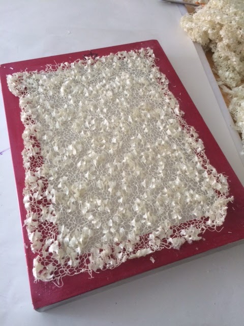
Residue print made to soak up the excess print paste
I really love this one
Layering colours is proving to be tricky. The more layers the thicker the print becomes and stiffer the cloth gets. Ghosting is a becoming a big headache! In some samples smudges can be seen clearly. Once washed and ironed the samples the bottom layers became obvious through the top layers (which I didn’t mind but didn’t expect at the beginning).  I made several prints until the final one. I made prints to paper using excess paint. Some of these residue prints are better I guess. They are going into my sketchbook.
Print on paper- deciding the colours
Print on paper - template disintegrated and I sticked it to the print.
 I love the college it created
Overall I am happy with the results. It can be more precise, or I could have ben less ambitious.
 
Final Print
Reflections on the outcome:

Although I explored several techniques, maybe I was a little single minded throughout the process. I wanted to create layers of colour, pattern and texture.  I wanted the print to be rich. Maybe I could have pushed other techniques further (eg Vilene). I had so many failed attempts at the beginning that I desperately needed better results. Therefore didn’t persevered in the failing attempts. I went for a simpler technique (cut out templates) but pushed for colour and texture. Background was very important in all samples, I used a lighter colour for the emphasis on the foreground. Producing repeats were very difficult. I cannot claim success on repeats. However I tried to work with ghosting, random repeating to create a more organic feel with a sharp geometric image.

Screen-printing can be unpredictable, prone to mistakes and if you do not have a durable template design, is difficult to achieve decent details in your pattern. On the other hand, it is playful generating interesting results. I liked working with Procion MX dyes as much as pigment dyes, especially the breakdown method. However Procion dyes can end up being dull after wash and heat treatment. I must look more into that. I found working with pigment paints is much easier.

This assignment made me think a lot about patterns and how to design them. It is an important skill and not as easy as it looks.

I believe I tried really hard on this assignment. I enjoyed it very much. Screen-printing is a bit like photography wet printing.  It took me to my good old days in the darkroom. The process in dark room involved several chemical processes affecting the outcome, too. It is a tactile experience where you cannot always control the outcome completely, but can set the framework where the magic happens. Screen printing is very much like that.

Looking forward to next assignment.

Books I read and used during this assignment:

  • Screen Printing, Layering Textiles with Colour Texture and Imagery, Benn C., Morgan L., 2009, Committed to Cloth Publications
  • A Field Guide to Fabric Design, Kight K, 2011, Stash Books
  • Art Cloth, A Guide to Surface Design for Fabric, Dunnewold J., 2010, Interweave Press LLC.
  • The Print Making Book, Mooncie V., 2013, Guild of Master Craftsmanship Publications Ltd.


Assignment 2: Screen Printing Stage 2 and 3

Stage 2 and 3: Screen Printing Techniques:

I explored the idea of using lines to create texture with gelli plate one afternoon. The idea is to make a rich background pattern using lines. Can I re-produce them with screen-printing? With gelli plate you can mix colours enables you to layer colours in one print however you cannot repeat the process and reproduce same pattern easily. On the other hand screen-printing is about precision and repeats. But layering colours is not a simple task. I found some mesh, nets and knitted pieces to use as templates to emulate the effect.
S Payne Sketchbook Work: lines and texture 
S Payne Gelli Print
I decided that I am going to use several techniques of printing suggested in the textbook and maybe some more.

Method 1: Using existing templates for screen-printing:
Fist things first: I prepared my chemical water, print paste and thickened Procion MX dyes in bottles with small nozzles. Following Benn and Morgan’s (Committed to Cloth) advice I prepared a batch of cotton cloth soaked in soda ash. So the “fixing agent” is in the cloth not in the dye. Apparently this extends the dye to be used longer then a day and I do not anticipate finishing it all in one day.

After the first day of screen-printing at home, I can easily say the results are a good bunch of failed attempts. I am trying to cheer myself up thinking: “I can use them as background to future projects.”
S Payne Using a textures mesh to print
S Payne Gardening Mesh
Print Made Using the Gardening Mesh
Knitted Scarf
Print made using the knitted scarf
I guess the mesh, nets I used were very thin. Not enough area to have a definitive print. The knitted fabric I used for template soaked up all the print paste, hardly any transferred to the cloth. The texture is transferred on the back of the screen but not to the fabric. I had to lift the template and press the cloth to the screen (like a gelli plate) to get a print. Result is ok, but technically not screen-printing.

Method 2: Acrylic paint Permanent Designs:
Next I tried to use acrylic paint to created a permanent pattern on the screen. For this I bought some mesh and stretched it myself onto a picture frame. I used the gelli plate again to transfer the design onto screen.  After waiting a day for it to dry I am ready for printing. It was looking promising until I stated printing. The acrylic paint disintegrated during the printing (maybe I applied to much pressure with squeegee) or I didn’t fix it the acrylic paint properly. Disappointing!
Gelli Plate used to print on Screen 
Printing destroyed the template image - not very permanent!
Resulted Print
Method 3: Breakdown Printing:
I decided to try “breakdown printing” described in Benn and Morgan’s book.  Using the thickened dye paste (Procion MX dye mies with print paste - I used the recopies in the course book ), I scribbled directly onto the back of the screen and left it to dry. It created a pattern/texture which will be disintegrating slowly during the printing.
Pattern scribbled directly on screen 
Breakdown print result
Much better results and finally some progress. I also continued scribbling directly onto the cloth


Method 4: Vilene Stencils:

I made two templates of Vilene. It took me good 3 days to paint the templates themselves. I am going for more natural organic forms, softer lines for this one.

Vilene soaks up a lot of print paste and it requires some strength with pulling with squeegee. First template was too ambitious. I didn’t even get a proper print from it. The leaf template was better but I got weak prints. I wanted to do lots of repeats, increasing the darkness of colour I used. There was a lot of ghosting and smudging. I didn’t persevere. Another failed attempt! I think for this method you need to aim for your design well before execution. It isn’t easy to control and trying to work with precise designs is not a good idea. But for me the problem was not getting a strong print. It looked pale and muddy.


Method 5: Cut out method:
I started using pigments and a ready bought binder for this method. I cut out templates from paper  for printing. This is a really good method to print at home. However, template is too fragile and not usable after several prints. I had a few backup templates cut-outs to continue printing to layer prints and colour. Making multiple templates can be laborious however worth the effort I think. Otherwise you only produce a plain print.
Sketchbook - Turkish tiles motif
S Payne - Screen Printing with cut out template
I decided that I am going to use this technique but with sticky back tape, hoping it will last a little longer.

Method 6: Exposed Screens: 
I did a short Screen-printing workshop with Victoria Williams at Ochre Studios near Woking. We worked with exposed screens using photo emulsion. Ochre Studio has great facilities, which I don't have at home.  However access is limited, only Tuesdays and Saturdays for members. The first image I used is a rose sketch, I did at the workshop. This was the trial run.  Second image is sketched at home with more consideration.
S Payne - Photo Exposed screen - Discharge Print Close up
S Payne Sketchbook
S Payne - Photo exposed screen - Discharge print 
We made several prints using pigments, discharge paste, and metallics. I liked the discharge method the best. You can get some definition around the outer lines of your pattern. While the colour is lifted off it emphasises the outline of the design.


But I am worried that I will not be able to replicate this at home.

Assignment 2: Screen Printing Stage 1

Stage 1: Sketchbook work:

I am very excited about this project but I have been warned that it is a tricky one to do at home.

The course textbook suggests exploring man-made structures, lines, abstract shapes, textures and flat colours. So I started sketching the old fixtures and fittings at my new house. The house has some retro objects, lampshades, heavily patterned tiles, curtains and glass doors. I am drawn to the glass items, which have very geometric textures. These provide very organic shapes with the change of light. I liked that. But sketching them was very tricky.


I saw this vase in an interior design magazine. I love the pattern on it, simple triangles.


My next inspiration came from drain covers. I photographed them during school-run. Very simple designs easy to apply to any template and the rusting iron background provided rich texture and lovely colours. So I am thinking, if I am going to employ a simple shape I need to enrich the pattern with colour and I need to work on the background.

S Payne - Drain covers - Sketchbook  
S Payne - Drain covers - Sketchbook
While working on sketchbook I am also getting my materials together. So many considerations regarding technique, the equipment and chemicals.  At my shopping trip to George Weil, I found a very useful book: ‘Screen Printing Layering Textiles with Colour, Texture and Imagery’ by Claire Benn and Leslie Morgan. They are Surrey based textile artists with studio name Committed to Cloth.  I read the book cover to cover. It introduces a lot of techniques, explains clearly the differences of working with Procion MX Dyes vs Pigment Dyes, and is full of visual examples. The artists focus on texture and colour rather then precise repetition of pattern.
S Payne - Drain covers - Sketchbook
After some consideration, I decided to purchase 2 screens and decided to work with both Procion MX dyes and pigment dyes. I bought a few primary colours pigments and dyes, along with a metallic and luminous pigment to have some fun.  


For at least 4 weeks, all I did was sketching and trying to develop these sketches into patterns. I used collage a lot to play with the image, changing scale, moving it around, and thinking of negative and positive spaces. I used some of these outcomes as templates in my printing experiments.