Monday 29 May 2017

Assignment 5 - Personal Project - The Final Design


Making the Final Piece:

I started with mixing my colours. I am using Selestine pigments and solvent-free binder to prepare my printing pastes. I chose deep dark to light blues accompanied with a contrasting orangy peach. I had a good idea where I wanted to go with the colours and used my trusted colour wheel to guide me.  However, I am not sure if I should print on white or coloured fabric? And the pattern design is still work in progress. I want to do some test prints before I finalise the design.
S Payne - Mixing colours for print
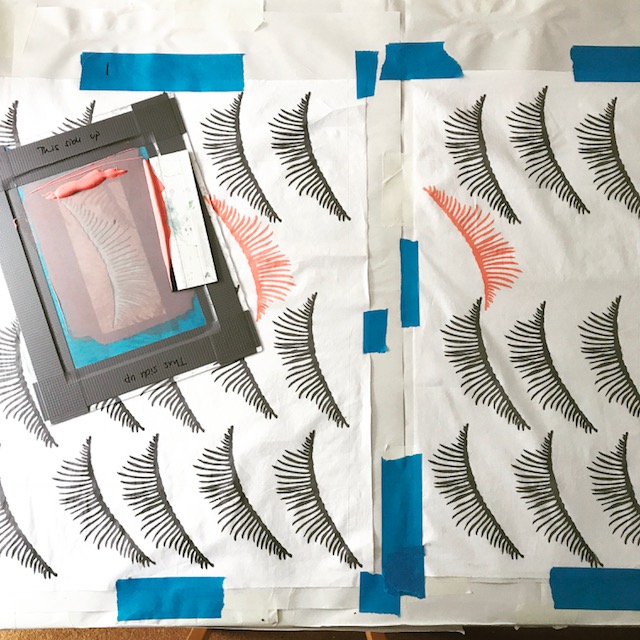
I am very pleased with my thermoflax screens. However printing with them is tricky. Ghosting is a big problem, messing up my pattern. I started to use a hairdryer and dry as soon as I print. I am printing on lightweight cotton in white. I want the fabric to be fluid and light.
My thermoflax screen
S Payne Test Print - Ghosting is a major issue!
Pattern… After initial test prints, I decided that I don’t want the print to look too precise. I still wanted that hand printed feel. I planned the pattern so that I know how to position my screen. I am still working organically following the pattern design but not to the letter. After all, the plan is a scribble on an A4 paper. I am only using the Screen No1. The combining two designs did not work well.
S Payne Test Print - Combining two designs doesn't work
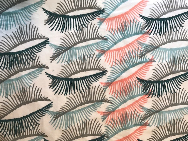
I love the print on white fabric. It’ll make a great garment, a skirt perhaps? But it is too cheerful, too pretty and too spring-like. I want the final piece reference the source images and imitate the feeling they evoke.
S Payne - Printing on white fabric
S Payne- Finished print on white cotton fabric
S Payne - Initial garment ideas 
I used a blank screen to create a grey background. Using same colour palate, the prints on grey are more muted and moodier. I still want to introduce stitch to the mix.  After some thought and sketching, I decided that I want the final fabric to be constructed from 3 different pieces joined up loosely. There will be gaps and long stitches to join them. I bought polyester lining fabric to print on it with the darkest blue. I am thinking to use a combination of machine stitch and hand stitch over the prints. At this stage, I am short of time so I’ll just go for it.
S Payne - Print of Grey background.  
S Payne- Machine Embroidering on printed fabric
This is working. I am glad I was bold to introduce stitching.  It enriched the texture and made the surface much more interesting. I constructed the fabric by sewing the parts together. I used a net over the machine embroidered piece to add more texture. The net created a gap between parts too. I hand stitched them with long stitches to emphasise the structure. I am aware that long hand stitches will be a pain when this fabric is made into a garment. They will get caught up and be pulled in all places. Not practical at all. But I still want them. I think they are an important part of the piece communicating the fragility, and temporary nature of life. They also mimic the forms of bones.

S Payne - Hand stitching on Final piece 
This is the final version of the fabric. It is fluid and fragile itself. Through the design progression, I worked with the material and responded to the process instinctively at every stage. I am glad that I made the thermoflax screen design, played and experimented with it organically. I am pleased I introduced both machine and hand stitching rather boldly at a very late stage.
S Payne - Final Piece
S Payne - Final Piece Detail

S Payne- Final Piece as a possible skirt 
It is always interesting to experience how far you can stretch an idea. As always I worked towards a visual outcome. Practicalities were sidelined a bit. I have travelled some distance from the starting point. I still tried to stay true to the original feelings I got from the source image and did my best to emulate them. The subject matter can be explored further and the design can be refined for sure. I am happy with the final design.

I look forward to what my tutor’s report now. 


Assignment 5 - Personal Project - Continued

Sketchbook Work and Developing Design Ideas: 

First things first, let's do some sketches and explore visual outcomes. Below are some samples I drew with charcoal, ink, and wax resist. 
S Payne Sketchbook - Fish Bones wax crayons and ink
S Payne Sketchbook - Fishbones Ink
S Payne Sketchbook - Fish Bones Pencil and Wax Resist
The first thing I notice is that there are so many details in each image. Do I want to record all the marks or do I want to be selective? What colours should I use? Bold colours or pastel? Bright colours to contrast everything the image represent or colours of decay to represent its true nature?

I experimented with relief printing using polystyrene. I like the marks this process creates. Can I replicate them for a pattern on fabric? I don’t want a pattern with a whole fish image in it. I want an abstract pattern. I still want it to radiate the same feelings…  feather like vulnerability vs. strong hard structure.
S Payne Sketchbook - Relief Print
S Payne Sketchbook - Relief Print and Stich

I tried a wax resist technique on a piece of fabric and failed miserably. Without investing in proper batik equipment, there is no use in pursuing this route I think. Wax resist pieces on paper, however, are lovely.

Let's introduce some stitch onto these sketches. Here are some machine and hand stitched pieces. I love the machine-embroidered samples. I think the style of machine embroidery translates the source images very well. 
S Payne Sketchbook - Fish Bones
SPayne Sketchbook - Fish Bones Free Machine Embroidery
SPayne Sketchbook - Fish Bones Free Machine Embroidery on kitchen paper and voile.
SPayne Sketchbook - Fish Bones Free Machine Embroidery on cotton,

But these are very detailed sketches that will be too busy for screen printing. I need to simply them or not screen-print at all. For that, I need to study the basics of the structure more, simplify its shapes.


Developing Design Ideas:

I explored and drew the joints and feather-like bone shapes. How delicate and gentle they look.
S Payne Sketchbook - Exploring the structure of the fish skeleton
S Payne Sketchbook - Exploring and simplifying the structure of the fish skeleton
Are these too delicate? Can I make cut out templates from them? I think they are too fine for cut out templates. Paper cutouts will disintegrate during the printing process. I really dislike working with Vilene interfacing templates. They are not great for detailed designs either. To achieve a decent detailed print,  I need to use either photo emulsion or thermoflax screens. 

I searched online found a company that prints bespoke thermoflax screens. I can design my own thermoflax screens. This decision affected the design of the template completely. You cannot have grey areas in thermoflax screen but it allows you to achieve finer lines. I modified my sketches and designed two templates for print screens. Sometimes the simplest is the best.
S Payne - Design1 for themoflax screen
S Payne - Design2 for themoflax screen

I used the company http://www.thermofaxscreens.co.uk They were amazing and very quick with delivery.

Next job is to start test printing and work on the pattern. The final product is still not clear yet.

Assignment 5 - Personal Project - Part 1

Reviewing my work so far:

The first task at hand is to review the work I’ve done within the Exploring Ideas course. What inspired me the most? Which techniques I liked working with? Which ones I got better at?

During the time of this course, I have learned several techniques. I networked better within my local area and found textile workshops and classes, which really helped me with the assignment tasks. One was the screen-printing workshop at Ochre Studios. The other one was a series of one-day workshops at Godalming College run by Emma and Norma Textiles. They don’t have an online presence but they are a real gem to find. Working on assignments I discovered new approaches, found new inspirations and learned new skills. Looking back the work I have done three textile techniques stand out for me:
  • Screen printing. I love mixing colours and creating new colour combinations for print. I love designing patterns and layering them on with various colours.
  • Stitching. I love machine embroidery or hand stitching. I try to incorporate stitching in my sketchbook work often now. Simple stitches can be very effective and bring life to the piece at hand.  
  • Wax resist. I experimented with wax-resist technique. (This isn’t covered in the curriculum). I love the fact that you can build up colour and shapes so effortlessly. You can utilise the images to build up patterns for further use. I mostly experimented on paper but I would like to take it to textiles and work on batik more. 
S Payne Pattern created using wax resist and inks. 
Reflecting on how do I develop ideas and implant them: Well…. Like many fellow students, I am time poor. I work fast with quick sketches. I like to draw with jagged lines. It is something I developed instinctively after I have seen A. Giacometti’s work back in the 1990s. I snap lots of photos or trawl the Internet for inspiration. I intend to choose source images that are rich in texture and shapes, which can be turned into patterns. I love photocopying too. It enables me to play with scale. I love working with the black and white version of the image, too. It helps me see different forms in the image. Any process applied to the image changes it slightly and brings out its different properties. I loved material led approach, which was introduced in Part 3 of this course. I enjoyed its intuitive attitude – working by responding to the material and the process rather than following a strict design plan.

Soo… This is the final project of my own choosing. What will I make?

Initial thoughts: I would like to create a fabric… a printed fabric that can be used for garments or home décor. I am thinking of combining print and stitch. I want to follow material led approach.

I chose fish bones as source material. It is an impulsive choice. The images I found are visually strong, suggesting fatality, decay, weakness, and ‘the end’. The bones are milky white and sculptural. They harbour contrast: they look vulnerable but they are strong. Stripped of flesh they are a bit scary. If you can pass the whole “death” thing, you can see the beauty in their form. The beauty within the ugly…
Photo: Dave Russ / Wikipedia
X-Ray Fish Image Source: Wired article 

I made a Pinterest board for the images I have gathered: https://uk.pinterest.com/saadetpayne/fish-bones/

While collecting and pinning I found out about a few textile artists and designers who were inspired by the same subject matter. The beautiful crochet sculptures by Caitlin McCormack for example. They are amazing. Building the bone structure from a thin cotton thread, her crochet sculptures contrast the soft and gentle material they are made from. They also defy traditional use of the crochet technique. But for me visually they communicate the uncomfortable emotions bones evoke. http://caitlintmccormack.com/section/323579-Sculpture.html
Caitlin McCormack - Et Erit 2016
My second find is the intricate fish bone collages by Chinese artist Lin Hanbing. He is a very meticulous artist obsessed with the material he works with. He puts fish bones through a long process of cleaning and sorting and turns them into beautiful and peaceful images in line with traditional Chinese painting. Fascinating workhttp://www.odditycentral.com/art/fish-bone-painting-the-unique-art-of-han-bin-lin.html
Lin Hanbing Fish Bone Collage on Canvas
I also need to mention Iris Van Herpen and her latest collection. “Between the Lines” is a great inspiration. Van Herpen combines 3D printing techniques with garment construction with mesmerising results: http://www.irisvanherpen.com 

Iris Van Herpen 2017 Hot Couture Collection
Plenty of inspiration and lots of visual simulation. At this point I am not sure where the project is leading, I have only very loose ideas.