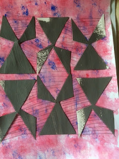
The Final Design:
I am working from one
of my first sketches at the beginning of the assignment. The vase. It has very
simple triangle shapes, which, I hope to layer on top of each other with
different coloured print each time. I have been developing this design along my
print experiments. I tried several
versions of how to layout the pattern.
 |
| First Sketch |
 |
| Scaled up collage |
 |
| Scaled down collage emphasis on both positive and negative spaces |
 |
| Experiments with the layout of the pattern |
 |
| Another negative version of the pattern |
 |
| Experiments with the layout of the pattern |
And most importantly what colours? I got my trusted
colour wheel out and decided to start with mixing colours. I mixed
around 8 colours, yellows blues and aubergine/deep purple-brown. I mixed
luminous yellow in two colours it gives increases light reflected. I couldn’t
use luminous yellow on its own. It would be too intense. When mixed it gives
other colours a lift.
 |
| Sticky back tape template |
 |
| Color mixing |
I made 4 templates
from both the negative and positive images of the design with two scales (smaller and
the intended size). I am printing with smaller size first with darker tones,
layering lighter tones with bigger size. I am drying the cloth and fixing the colour (with ironing) in-between prints. I am using a very geometric pattern, but my
intention is to print in multiple directions emulating a more organic pattern.
There will be a level of control and randomness at the same time. That’s the
plan.
 |
| First Print |
 |
| Second Print using the background print made in earlier print attempts |
 |
| Residue print made to soak up the excess print paste I really love this one |
Layering colours is
proving to be tricky. The more layers the thicker the print becomes and stiffer
the cloth gets. Ghosting is a becoming a big headache! In some samples smudges
can be seen clearly. Once washed and ironed the samples the bottom layers
became obvious through the top layers (which I didn’t mind but didn’t expect at the beginning). I made several
prints until the final one. I made prints to paper using excess paint. Some of
these residue prints are better I guess. They are going into my sketchbook.
 |
| Print on paper- deciding the colours |
 |
| Print on paper - template disintegrated and I sticked it to the print. I love the college it created |
Overall I am happy
with the results. It can be more precise, or I could have ben less ambitious.
Reflections on the
outcome:
Although I explored several techniques, maybe I was a little single minded throughout the process. I
wanted to create layers of colour, pattern and texture. I wanted the print to be rich. Maybe I could
have pushed other techniques further (eg Vilene). I had so many failed attempts at the beginning that I desperately needed better results. Therefore didn’t persevered in the
failing attempts. I went for a simpler technique (cut out templates) but pushed
for colour and texture. Background was very important in all samples, I used a
lighter colour for the emphasis on the foreground. Producing repeats were very difficult. I cannot claim success on repeats. However I tried to work with
ghosting, random repeating to create a more organic feel with a sharp geometric
image.
Screen-printing can be unpredictable, prone to mistakes and if you do not have a durable template
design, is difficult to achieve decent details in your pattern. On the other hand, it
is playful generating interesting results. I liked working with Procion MX dyes
as much as pigment dyes, especially the breakdown method. However Procion dyes can
end up being dull after wash and heat treatment. I must look more into that. I
found working with pigment paints is much easier.
This assignment made me think a lot about patterns and how to design them. It is an important skill and not as easy as it looks.
I believe I tried
really hard on this assignment. I enjoyed it very much. Screen-printing is a
bit like photography wet printing. It
took me to my good old days in the darkroom. The process in dark room involved
several chemical processes affecting the outcome, too. It is a tactile experience
where you cannot always control the outcome completely, but can set the
framework where the magic happens. Screen printing is very much like that.
Looking forward to
next assignment.
Books I read and used during this assignment:
- Screen Printing, Layering Textiles with Colour Texture and Imagery, Benn C., Morgan L., 2009, Committed to Cloth Publications
- A Field Guide to Fabric Design, Kight K, 2011, Stash Books
- Art Cloth, A Guide to Surface Design for Fabric, Dunnewold J., 2010, Interweave Press LLC.
- The Print Making Book, Mooncie V., 2013, Guild of Master Craftsmanship Publications Ltd.

No comments:
Post a Comment